Vendera
Fictional Case. A client has commissioned the design of a grocery delivery app for city-centre residents in Stockholm with the hope to later expand to other cities. The app’s unique value lies in offering express deliveries within 10 minutes, enabled by centrally located “dark stores” and bicycle couriers. Unlike Foodora Market or Mathem, the service focuses solely on groceries, avoiding restaurant meals or bulk shopping, and instead addresses short-term, spontaneous needs.
Research summary
The client, with the help of a user researcher, has analysed the existing market and identified opportunities to increase customer and business value, driven by user needs and unique selling points below.
Main User Needs
From our survey and interviews of which you can see the highlights below, we noticed that most people today used their phones to keep up to date on the news, gain information and get engaged in their communities. Peoples main problems with emergency planning was their lack of knowledge, lack of perceived space, and financial difficulties. People also felt that there wasn't any urgent need to start saving food until they had a concrete emergency they were planning for.
To try to combat these problems we set about creating a digital app to help people track the food and water they have at home, get informed about the latest information MSB has released, as well as interact with their neighbours and family members to create a more cohesive neighbourhood and promote friendliness and cooperation.
To try to combat these problems we set about creating a digital app to help people track the food and water they have at home, get informed about the latest information MSB has released, as well as interact with their neighbours and family members to create a more cohesive neighbourhood and promote friendliness and cooperation.
Unique Selling Point
The client sees an opportunity to gain market share by offering a new service that differentiates itself from competitors in two ways: First, by offering a more focused product experience compared to competitors which means focusing solely on grocery shopping from its own store, completely excluding restaurant orders or purchases from physical convenience stores.
Second, by offering an experience that is entirely focused on quick grocery shopping. The app will need to emphasize simplicity, speed, and a streamlined shopping experience. By helping people with extremely limited time act faster and more easily than through any other provider.
Second, by offering an experience that is entirely focused on quick grocery shopping. The app will need to emphasize simplicity, speed, and a streamlined shopping experience. By helping people with extremely limited time act faster and more easily than through any other provider.
Design
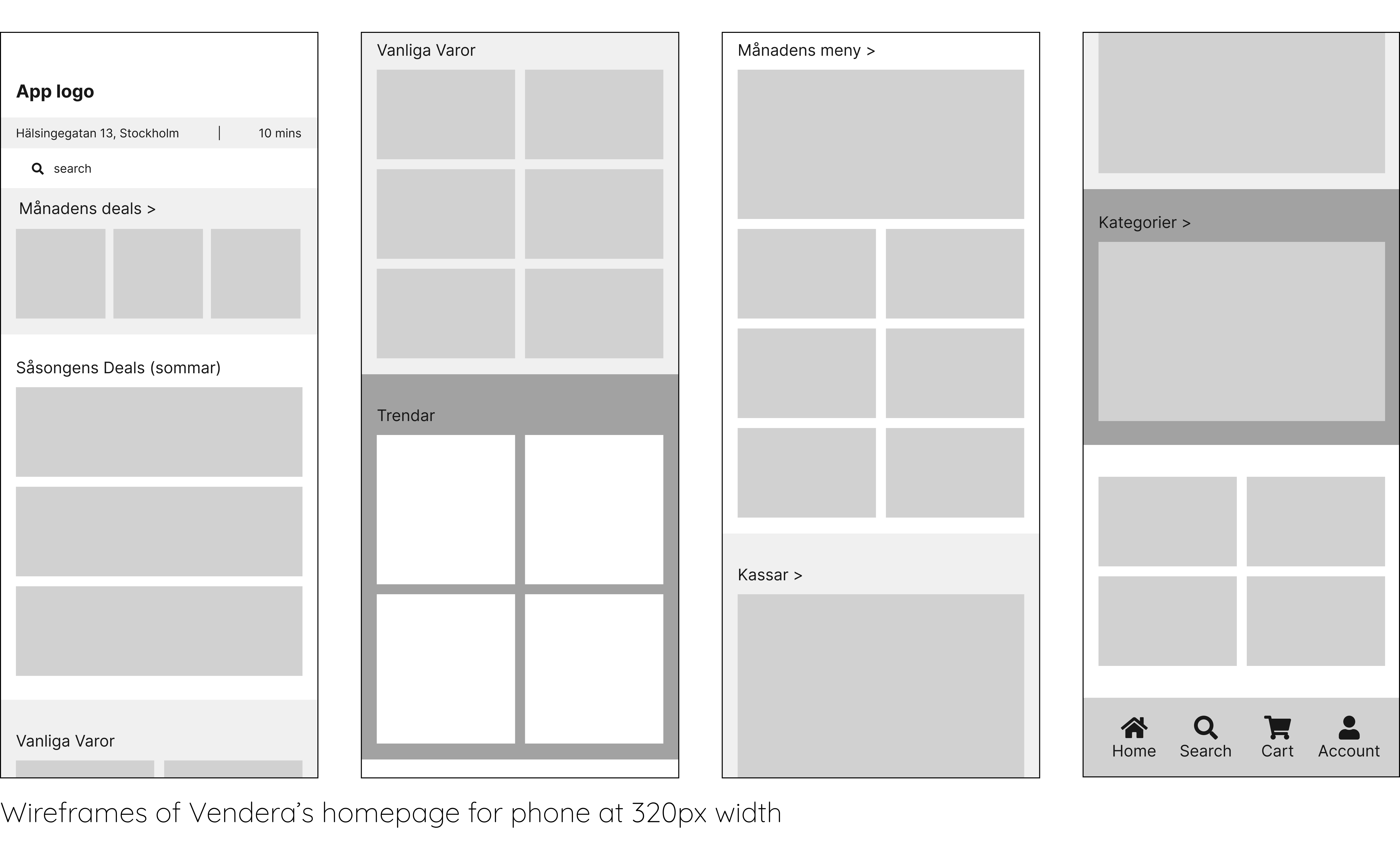
Wireframes
After the brief hand in, I went through the project requirements as well as the simple sketches provided by the client and restructured them as wireframes to create an overarching layout of the homepage as well as a product page for phone and tablet.
These wireframes' main function is to build a coherent design and focus on the spacing and structure of the elements on the page without getting distracted by colour, type choices, imagery, iconography or any other small details without ironing out the major elements of the design first.
I also started looking at the potential users' main needs. The clients' major concerns were about the efficiency and speed of the app. In addition to that, a major selling point for the app was to be able to sell you groceries you needed when you didn’t have the time to go to any shops and as such needed to be simple and fast to navigate. The design I created reflects on these values by being breathable and simple. For example, the homepage offers bundles and popular items at the top of the page to help its users find what they are more likely to need in a short amount of time.
Design system: Typography
After finishing the first round of wireframes and with a plan for the overall tone of the app in mind, I decided to shift my focus on the design system.
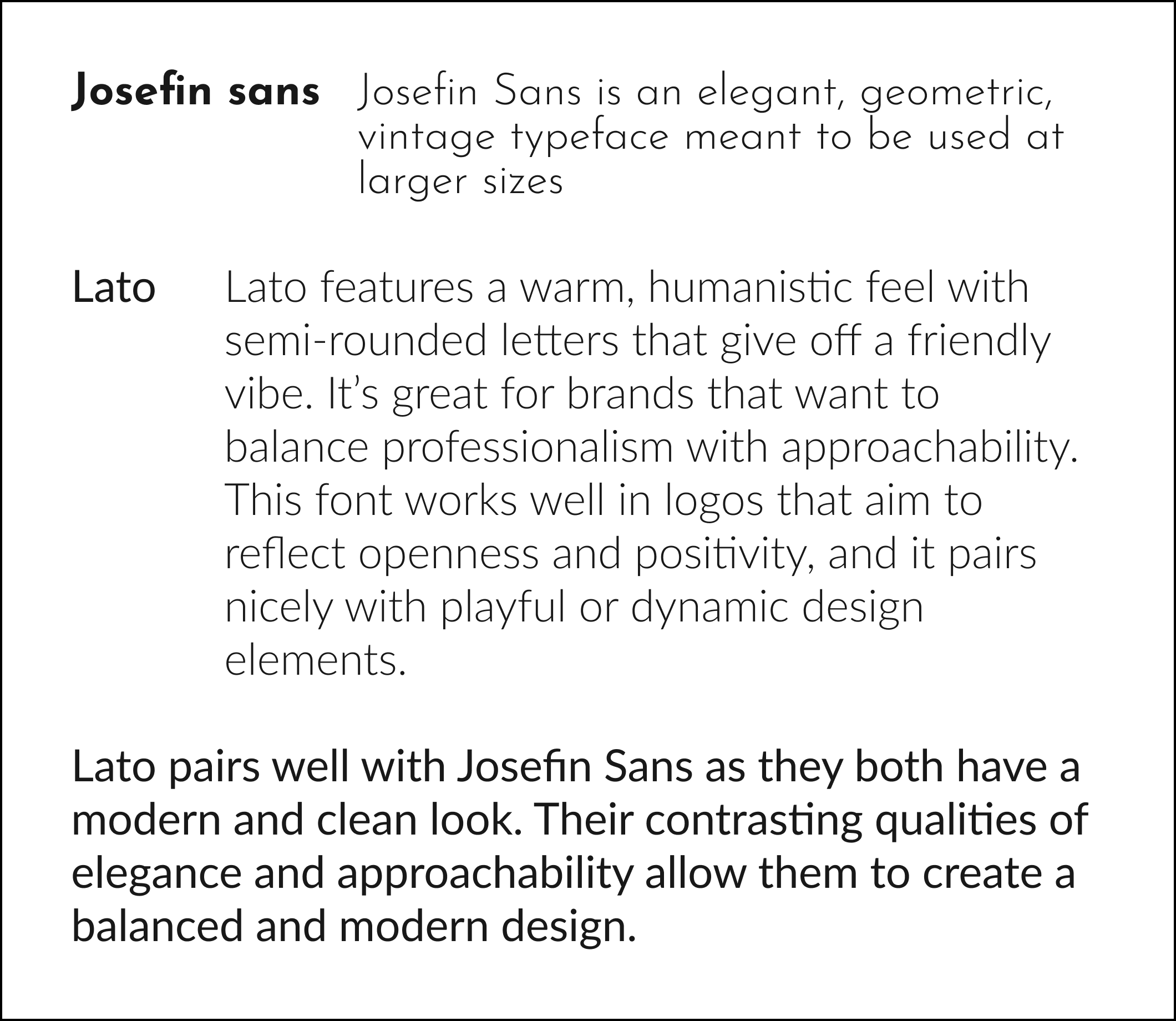
For typography, I worked with a font pairing of Josefin sans and Lato. Josefin sans was the first font I chose. I already knew that I wanted fresh colours and a geometric approach for the app, so I went with a geometric font for the headlines and titles. Josefin sans was the perfect choice for this situation. It is an elegant typeface meant for display at larger sizes with a hint of extra character to create more interest in the typography.
Lato was then chosen to compliment Josefin sans and be used in the main copy of the website. Lato is a humanist font which gives it a friendlier vibe to contrast with Josefin Sans's elegance and allows the design to look more approachable and positive.
Color Palette
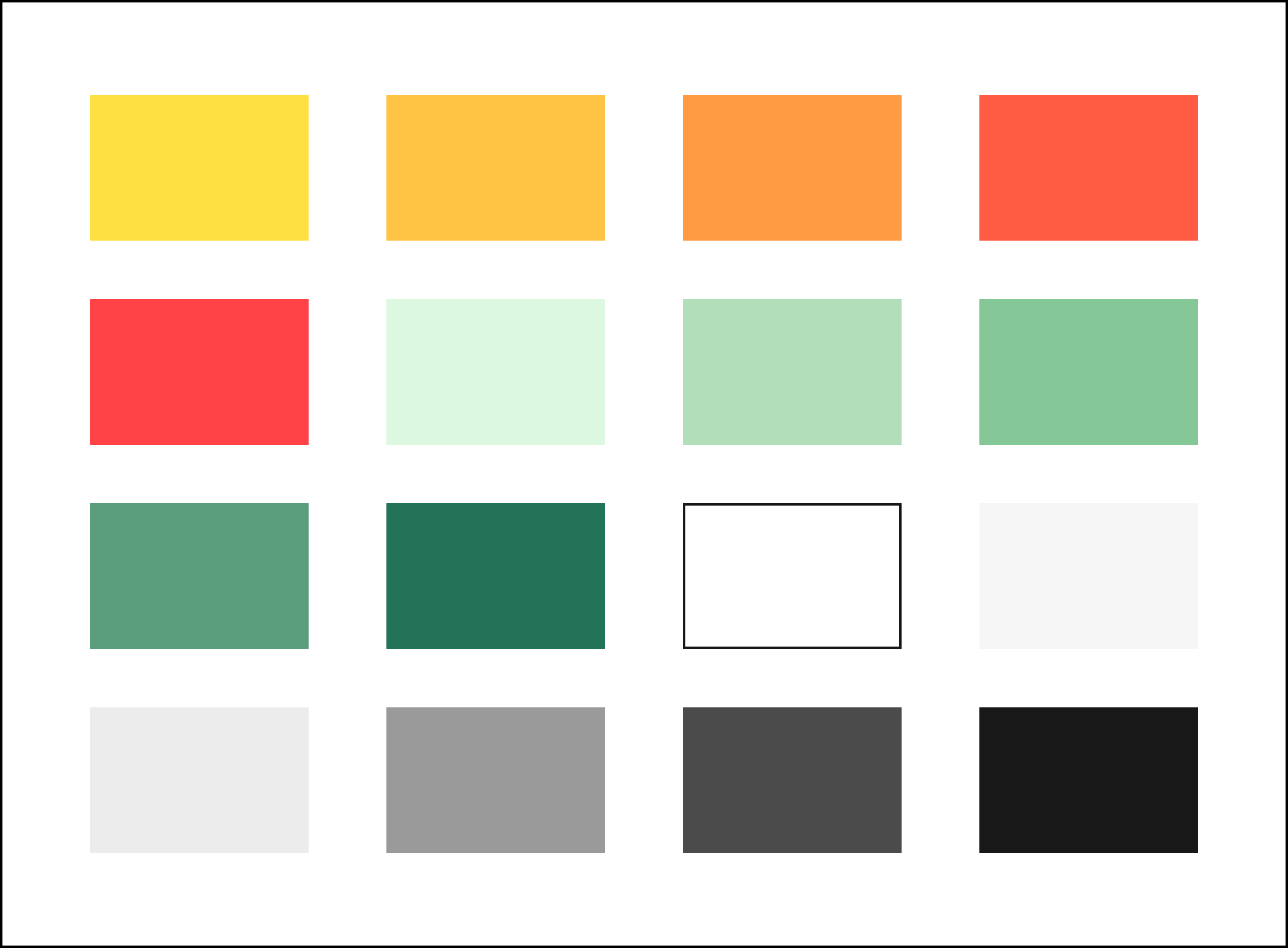
When deciding on the colour palette for the app, I considered what the client wanted to convey with the colour choice. The palette needed to be simple, refreshing and eye-catching so I started by picking bright and positive colours like yellow and green as a preliminary palette for the app.
For the final iteration, I expanded the greens and yellows into colour gradients. I also added neutrals for legibility and contrast and red as a warning colour. With more experimentation I also adjusted the palette to include all nuances needed to build an app.
Main colour symbolism:
Green: Calming effect, freshness, ecological.
Yellow, Orange: approachability, friendliness, positivity.
Feel free to go through the app prototype
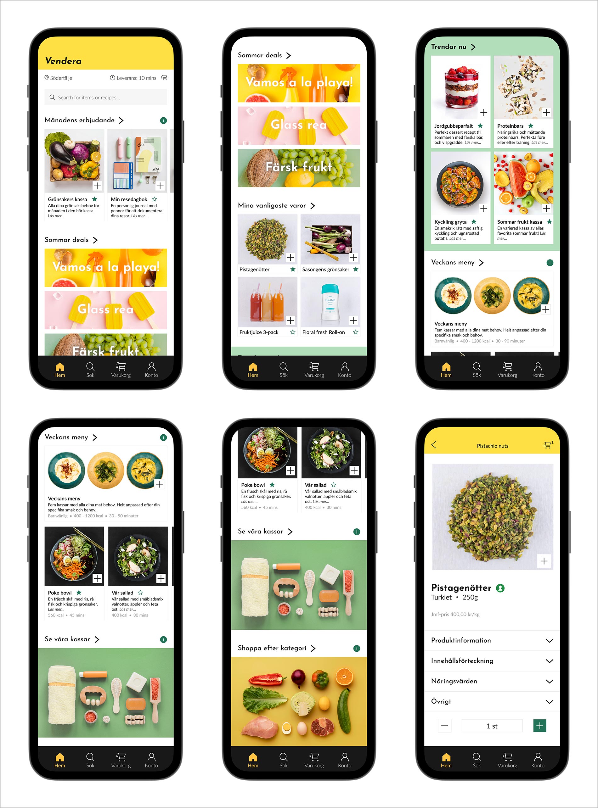
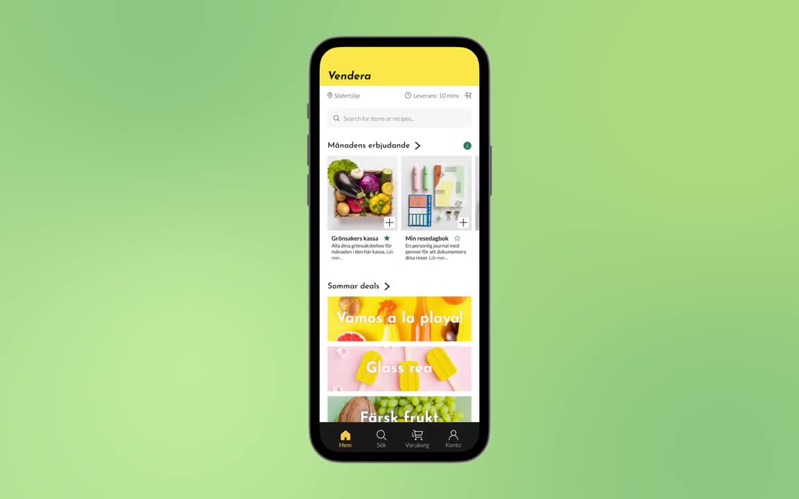
The app is designed with a modern, minimalist approach to provide users with a seamless and efficient shopping experience. Featuring a clean color palette and simple, intuitive navigation, the app focuses on ease of use, ensuring that users can quickly find and purchase products without unnecessary distractions. The use of consistent icons, strategic color choices, and thoughtful typography enhances the overall user experience, making it both approachable and engaging. With added features like arrows to signal interaction, clear item page indicators, and strategically placed icons, the app aims to increase order value whilemaintaininga harmonious and visually appealing design. The goal is to make the shopping process faster, more enjoyable, and straightforward, all while reinforcing the brand’s identity through cohesive product design and imagery.
Feel free to go through the app prototype
The app is designed with a modern, minimalist approach to provide users with a seamless and efficient shopping experience. Featuring a clean color palette and simple, intuitive navigation, the app focuses on ease of use, ensuring that users can quickly find and purchase products without unnecessary distractions. The use of consistent icons, strategic color choices, and thoughtful typography enhances the overall user experience, making it both approachable and engaging. With added features like arrows to signal interaction, clear item page indicators, and strategically placed icons, the app aims to increase order value whilemaintaininga harmonious and visually appealing design. The goal is to make the shopping process faster, more enjoyable, and straightforward, all while reinforcing the brand’s identity through cohesive product design and imagery.
High fidelity Wireframes